BOCON
Customer
BOCON
CATEGORY
packaging
PROJECT
Telling the story of product quality through images is our daily work. However, the project carried out for BOCON was a true journey, allowing us to discover a family dedicated to the pursuit of flavor and a collection of recipes that are truly one of a kind. Enthusiasm guided us throughout the project, which focused on creating a new identity for the BOCON brand and its entire line of frozen products for the retail market.LOCANDA'S RECIPE
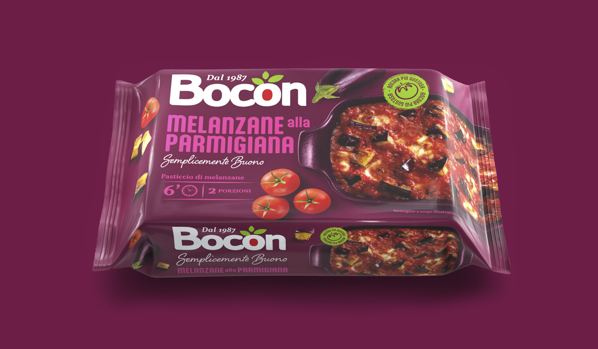
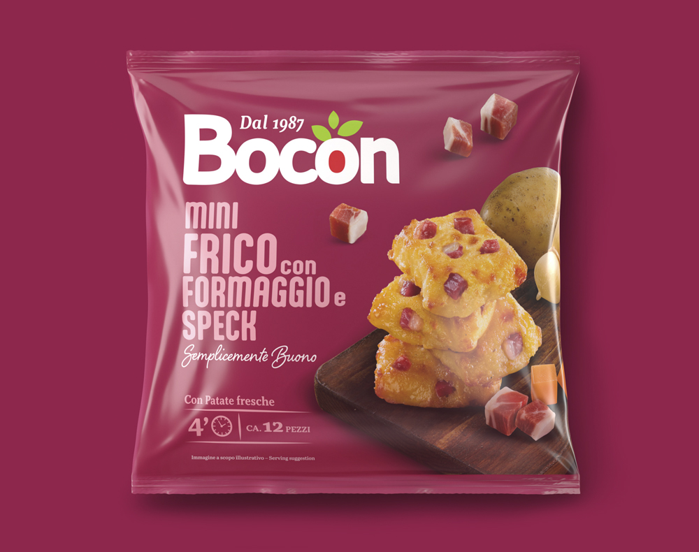
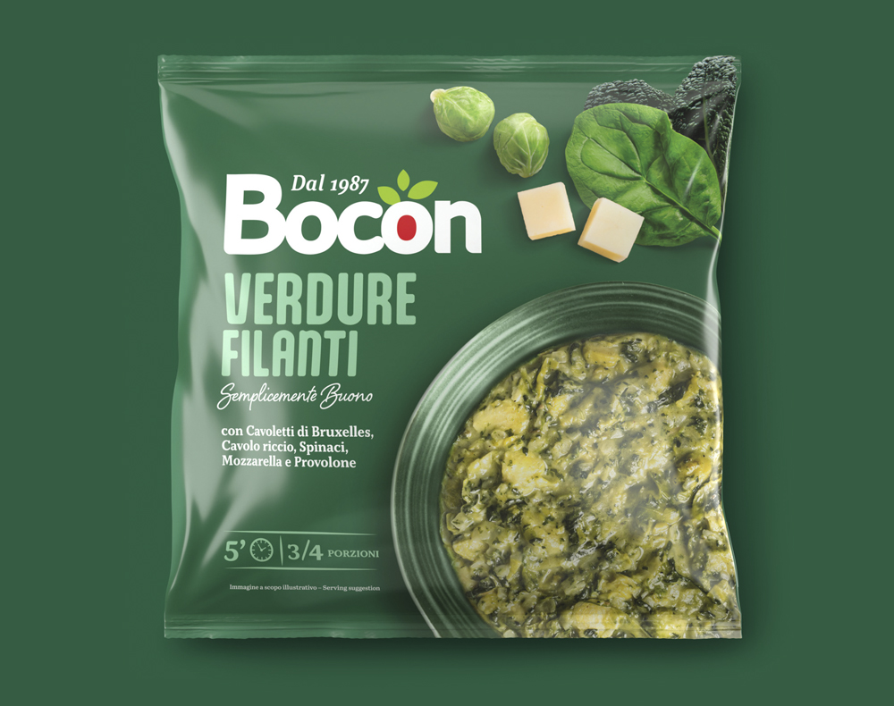
The communication of packaging within supermarket freezer cabinets presents an additional challenge due to the way refrigerated units are typically stocked. Often, the need to maximize fridge space results in bags being compressed, making the brand and recipes less readable. Starting from this disadvantage, we focused on simplifying the structure of the BOCON brand and enhancing its visibility on the package facing. The new logotype is significantly more visible than the previous one, while still conveying the quality, heritage, and Italian essence that BOCON represents in the food sector. For the line’s identity, we prioritized three key elements: packaging colors, dish photography, and recipe names. The colors were chosen to stand out in the freezer aisle, while the photos authentically showcase the care, passion, and flavors that Luca and Donatella pour into every culinary idea. For main courses and side dishes, photos are taken from an overhead perspective, while snacks are captured in three-quarter angles to highlight their flavor details. The product names, in contrasting colors against the packaging background, ensure that the recipes are easy to identify at a glance. After getting to know the BOCON family and tasting all their products, we unanimously agreed on the payoff: Simply good!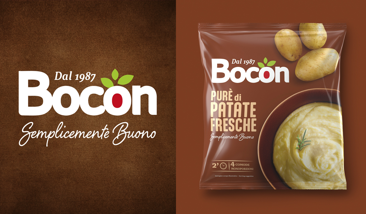
OTHER PROJECTS


